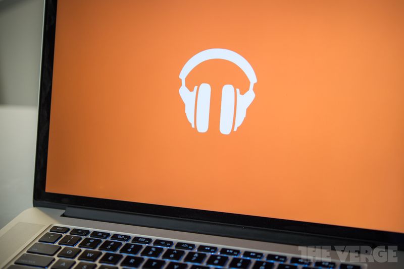
Today Google Play Music released an updated version with support for podcasts, but the much bigger deal — visually, anyway — is that new logo. Gone are the simple two-tone headphones, and in their place is a four color triangle-and-circles confection that closely resembles breakfast pizza. You’ve got the reddish, saucy crust, the yellow scrambled eggs, and the orange cheddar cheese. It’s topped off with a music note that, to these eyes anyway, comes across as goat cheese. Who’s hungry?
Google Play Music’s approach to design has never been subtle — nothing that shade of orange ever is. And it is all but legally required for bloggers to cry out in pain whenever anything anywhere is redesigned. But even with that in mind, there’s something trollish about the Google Play Music logo. The loud colors and the strangely truncated circles scream “look at me” in a way befitting a music service that, while better than it usually gets credit for, looks like an also-ran next to Spotify and Apple Music.
/cdn0.vox-cdn.com/assets/3219679/google-play-logo-stock1_2040.jpg)
I’m not sure the old headphones logo would have won any prizes, either. (Nor would Spotify’s “three curved lines in a lime-green circle.”) But it conveyed the purpose of the app with a clarity that in the new logo has gone missing. Pizza Play Music is not the worst redesign in recent memory — that honor goes to Uber’s baffling “bits and atoms” logo — but it does feel like a step backward.
[SOURCE:- The Verge]


