In the age of the iPhone, the art of managing a calendar is so efficient that we barely have to spend any time thinking about it. Like a high-priced personal assistant, our calendars work even when we’re not staying on top of them, dutifully pulling dates from emails and messages, and making sure we never forget a friend’s birthday. The smart, sophisticated iOS interface has turned calendar-keeping from an active, urgent responsibility into a passive one, and pretty much everyone who owns an iPhone now partakes in some form of day planning.
The best iOS calendars in the field don’t just look great, they offer their own unique concepts, distinguishing themselves by how they handle and present our data. Whether it’s event input, intelligence, social integration, or notifications, calendar app makers have added a wealth of features and functionality to the stock iOS calendar, to the point where Apple has even begun to borrow popular features just to keep up.
Nowhere is this more evident than in the impending shutdown of Sunrise (which was scheduled to fold on Aug. 31, but Microsoft stayed its execution). When it launched back in 2012, it offered a refreshing spin on the classic calendar. With a variety of app integrations, it combined events from places like Facebook, Eventbrite, LinkedIn, and Foursquare to create a complete picture of your work and play commitments. Smart, slick, and stylish, its color-coded events and minimal monthly view set a new standard for digital day planning, showcasing the enormous potential of multitouch and the untapped power of iOS. A steady stream of updates made it one of the best and most popular calendars in the App Store until Microsoft bought it in 2015 and subsequently announced that Sunrise would shutter this week. The company delayed the move to bring more features to Microsoft’s Outlook email app.
But while bits of Sunrise can be found in Outlook, its influence can be felt on calendars all over the App Store. Its sleek design and unique concept paved the way for generations of digital day planners, and dejected devotees won’t have to look far to find a worthy replacement. Here’s our list of favorites.
Contents
Winner: Fantastical
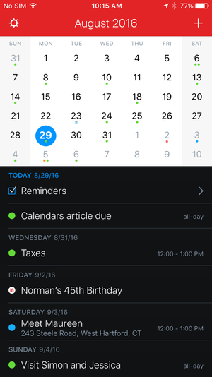
There are calendar apps, and then there is Fantastical ($5 for iPhone, $10 for iPad). What started as a Mac utility for die-hard date keepers has turned into the measuring stick for all other mobile calendar apps. From its perfectly-calibrated views to its downright pleasurable input screen, Fantastical doesn’t just live up to its lofty name—you’d be hard-pressed to find a flattering adjective that doesn’t apply.
Fantastical’s main screen has a definite Sunrise-style feel, with a chronological list of appointments displayed below a full or partial calendar month. Instead of a choose-your-own-account method, Fantastical piggybacks on Calendar, displaying only the accounts you’ve subscribed to in Settings. Serious Eventbrite and Facebook users won’t miss the in-app integration, however, as they likely have those events already plugged into their Google or iCloud calendars.
Its interface is simple enough to grasp in seconds, but that’s not to imply that Fantastical is merely a basic calendar. There are three views to choose from: The patented DayTicker, which boils your calendar down to only days that have events, a full dot-style monthly calendar, and a week view that offers an hourly overview of your upcoming schedule.
But while Fantastical can certainly function as a regular calendar, it’s not as much about days as it is about events. Where other calendars will show blank slots between appointments, Fantastical’s event list focuses solely on what you need to do. In fact, the only place you’ll see free time is in the weekly view, and that’s mainly for fixing scheduling snafus. It’s not unlike a to-do app in that regard, and it’s one of the many subtle ways that Fantastical sets itself apart from its competitors.
Event creation is an overlooked aspect of many calendar apps, but Flexibits spent considerable time on it. Foremost is its natural language engine. It might not be as novel as it once was (especially since more than a few of its peers have adopted the concept on their own way), but it’s still delightful to watch it parse a jumbled string of words into a sensible event.
Fantastical requires separate purchases for the iPhone and iPad, but the money is well spent. Whether you have a mini or a Pro, Fantastical makes the most of the extra pixels, adding support for Split View and Slide Over, as well as an expanded design that puts a greater emphasis on the calendar. And if you own an Apple Watch, you can get reminders and add events right from your wrist. But the iPhone app is the star here, offering excellent on-the-spot event creation and at-a-glance scheduling all in one of the most beautiful interfaces you’re likely to find. And if that’s not fantastic, I don’t know what is.
Runner-Up: Calendars 5
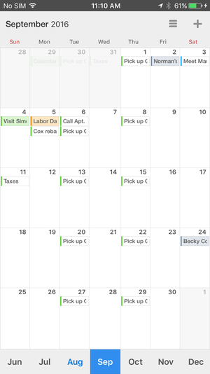
Readdle has been selling a calendar app for nearly as long as Apple has been making the iPad, and that experience can be felt all throughoutCalendars 5 ($7). Powerful, versatile, and just a little bit fun, the deluxe day planner will dutifully track your day with power and panache that defies its mobile status.
A variety of views is common among most top-tier calendar apps, but Readdle leaves no stone unturned, offering calendars in all shapes and sizes: You can choose to see your day, week, or month, a list of your events, or filter down to just tasks. While you won’t find anything to rival Fantastical’s DayTicker among the fairly standard display options, its variety of views is a testament to just how well Calendars anticipates and responds to its users’ needs.
Like Fantastical, Calendars picks up all of your iCloud entries, but a separate sign-in gives Google users a bit more control over syncing. All of the usual features are present here—recurring events, reminders, alerts, etc.—but Calendars employs a natural intuition that makes the whole process quite enjoyable. For instance, you can tap on an event to open a floating window that will tell you more about it (or let you change something). Or double-tap a box when in full calendar mode to quickly shift to that day’s view. Or my favorite: If you want to reschedule an event, simply drag its tiny colored rectangle to a different date.
And drag-and-drop isn’t the only desktop-caliber feature. Very little about Calendars feels much like a mobile app, and its utilitarian yet still elegant interface would be right at home on OS X. Even on the iPhone, Calendars’ user experience belies its tiny screen, with smart gestures and slick navigation that make scheduling a breeze.
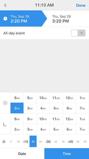
When it comes to event creation, Calendars excels there too. While its natural language engine isn’t quite as mesmerizing as Fantastical’s, it does well to understand what you type or say, whether it’s a simple lunch meeting or a weekly task. And if you want to do things the old-fashioned way, Calendars’ date selector is one of the best you’ll find, eschewing dials for a grid method that eliminates any fumbling and lets you create even custom recurring events in seconds.
And that, in a nutshell, is Calendars’ main appeal. Everything about it is designed for speed and simplicity, and after using it for a few days, Calendars just might be the sole calendar you’ll ever need.
Best for Android switchers: Google Calendar
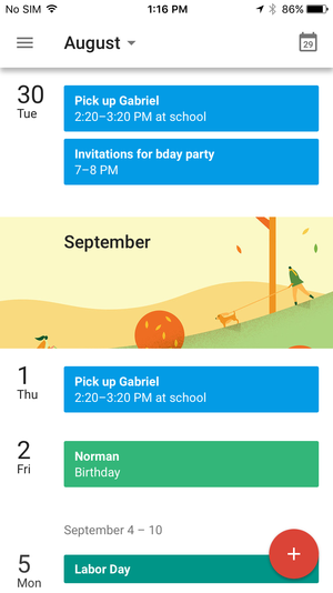
When you’re in a strange land, a little familiarity is always welcome. The same is true with OSes. There might be a fair amount of overlap with Android and iOS, but switchers still have a lot of new stuff to learn. Thanks to Google, a calendar isn’t one of them.
Google Calendar on iOS (free, iPhone only) is pretty much a carbon copy of the version it offers for Android users. While it may look out of place next to the calendars here that follow Apple’s interface guidelines, Google’s Material Design isn’t without its charms. And with iOS’s lag-free scrolling and touch response, Android users might actually get a better experience than the one they’re used to.
But more than that, Google Calendar is as good of a calendar on the iPhone as it is on a Galaxy. Switchers can see all of their appointments and birthdays without learning a new interface, and even veteran iPhone users will appreciate its colorful card-inspired look that gives events an extra degree of glance-ability—just so long as they don’t mind admitting that Android might not all bad.
Best for long-term planning: Informant
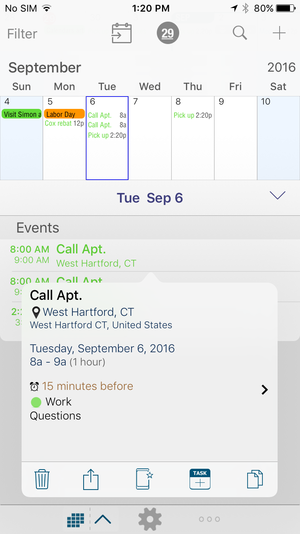
While any of the calendars here are as adept at planning next month’s vacation as they are with scheduling tomorrow’s business lunch, if you’re looking to chart out a serious long-term life plan, they might not fit the bill. But Informant (free to install, subscription required) will. Not only does it offer bountiful customization options that let you differentiate from things happening now and further down the road, it expands your events far beyond simply when and where they might be happening. If you’re scheduling a project, for example, you can add to-do reminders or you can easily attach a packing list to a future trip. You can also add memos and sub tasks to make sure nothing is forgotten.
But what makes its planning abilities truly awesome is its text editing. Surely it’s not the only app to offer in-event notes (in fact, even Apple’s own calendar has them), but Informant’s text capabilities are more than a mere extra field. You can write and edit full pages of rich text and attach images to create a complete picture of your event. Informant’s iPad interface could use a little updating, but if you’re an obsessive long-term planner, its impressive tools and customization options will let you hammer out every last detail of your event.
Best for short-term planning: Timepage
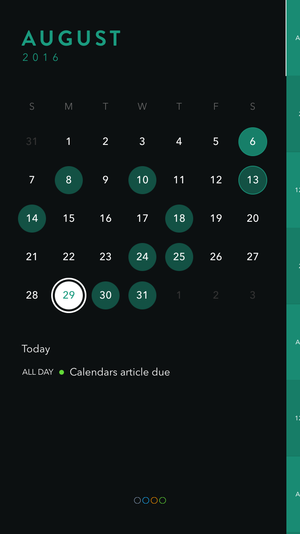
If you only use your calendar for the most important events in their life, many of the apps here are probably too much calendar for your needs. But if you still want an alternative to Apple’s standard Calendar, Moleskine’s Timepage ($5, iPhone only) might be just the ticket. Straddling the ever-thinning line between a to-do app and a calendar, Timepage doesn’t overwhelm you with features or options—rather, it offers an elegant spin on the day planner with a beautifully crafted, minimal interface.
Timepage utilizes a series of color-coded circles to illustrate your busiest days—a system vastly superior to the classic dot method, especially if you’re a casual calendar user. At a glance you can quickly see when your events are taking place, and scheduling a new one utilizes a delightful scroll bar that makes the process easy and fun. Events themselves get weather forecasts and travel estimates, all of which are also available on its companion Apple Watch app.
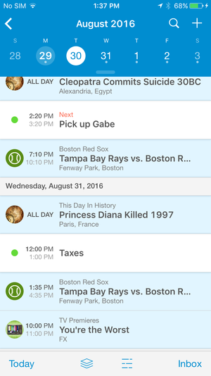
No matter which calendar you choose to make your own, there’s one thing that’s consistent across all of them: They’re only as useful as the data you feed into them. UpTo (free) takes a different approach. While you can use it to plan your schedule just like a regular calendar, it’s not just for tracking the things you have to do—it also keeps you up to date on stuff youwant to do.
UpTo is kind of like a page-a-day calendar for the digital age. With a variety of community calendars to choose from, the app does a remarkable job of turning your boring calendar into one you’ll want to visit each day. Along with your personal dates, UpTo shows you important dates in history, TV premiers, sporting events, concerts, and anything else worth knowing about. And it doesn’t clutter up your calendar to do it—to access your social calendar, simply pinch out on your main calendar to see what’s happening in the world beyond your own.
Others of note
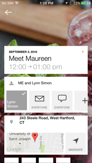
Much like the hundreds of wall calendars that fill the shelves of that kiosk in your local mall each December, the App Store is loaded with more calendars than you can shake a stick at. And while there might not be any that feature tiny kittens doing adorable things, you’re almost certain to find one that fits your tastes.
Anyone who enjoys the sleek stylings of Any.DO’s task management will love Cal’s (free, iPhone only) simple, breezy take on day planning. With a slick, speedy interface that puts a heavy focus on the people in your life, Cal turns calendar keeping from a chore into a downright pleasure.
If Cal isn’t minimal enough, Peek ($3, iPhone only) ditches the calendar format altogether. Clean and hyper-focused to the point where it barely looks like a calendar at all, Peek turns the traditional square grid on its head with a gesture-driven interface that will change the way you schedule and view your events.
If your life revolves around your calendar, 24me (free) wants to be at the center of it. More than a calendar, 24me keeps tabs on all of the things you need to remember—dates, to-dos, lists, notes and even bills—with a neat interface and a keen eye for organization. Like a personal assistant, 24me gets smarter as you use it and makes sure you never forget or blow off an important event.
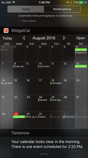
Several of the calendars here offer widget companions to their main calendar, but WidgetCal (free) is devoted to it—and it shows. With a bright, colorful design and a surprising amount of customization, WidgetCal puts a complete picture of your life right in the Notification Center. And if it didn’t have to rely on Awesome Calendar for inputting events, it would actually be powerful and flexible enough to be your main calendar.
That’s not to say being forced to use Awesome Calendar ($7) is a bad thing. Packed with loads of features, including to-dos, checklists, notes, and photos, the all-in-one scheduling app overcomes its somewhat stale interface by handling your tasks and events with swift precision.
[Source:-Macworld]


