APPLE seems certain to announce three iPhones later this year, with a premium model rumoured to have a 5.8-inch, curved OLED display.
The premium model, dubbed the iPhone Edition, is also tipped to have a full-glass body, Apple rumours have suggested.


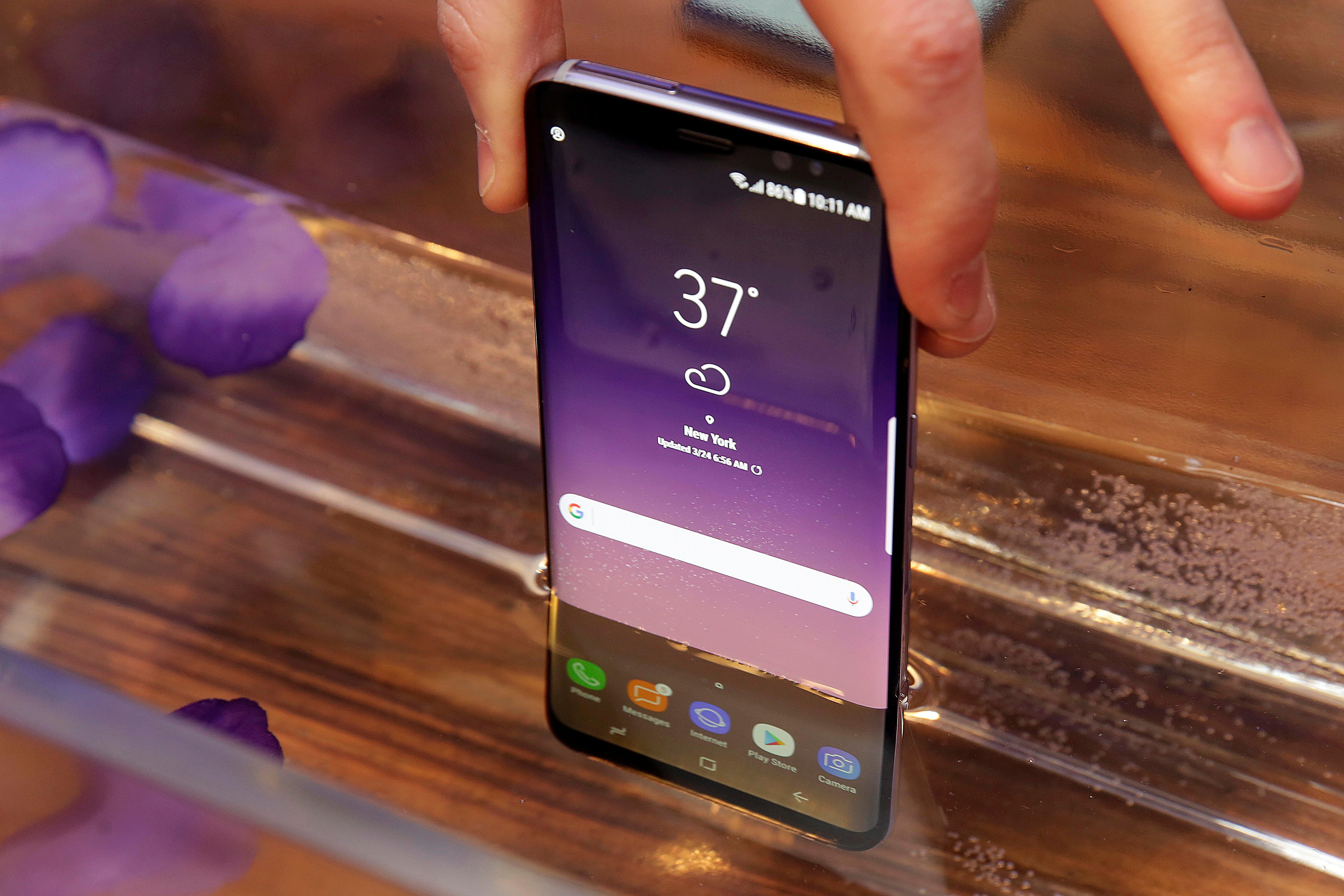
But Apple is tipped to follow in the footsteps of Samsung’s Galaxy S8 by removing the physical home button from the phone to allow for an edge-to-edge display, news.com.au reports.
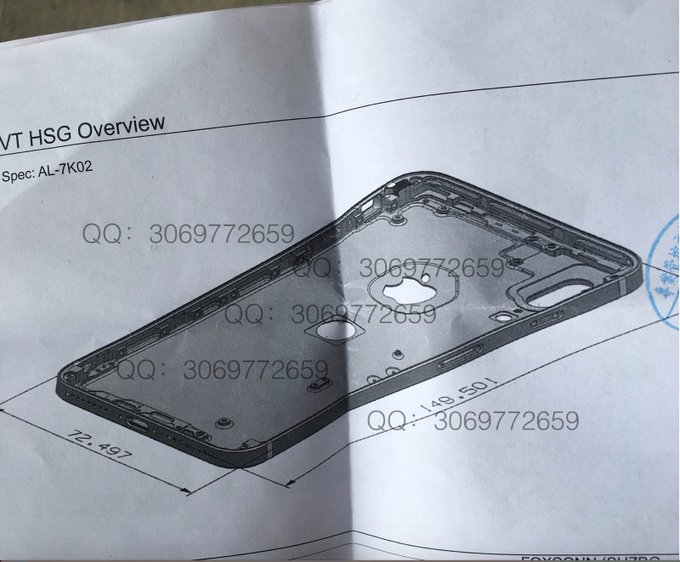
Last week, an Apple watcher with a proven track record of getting hold of accurate information about the tech giant’s products shared a schematic of the forthcoming device.
It showed the fingerprint scanner had been moved to the rear of the phone — a necessity given the removal of the home button.
While Android phones have had this feature for years, Apple users have been outraged about the relocated fingerprint scanner.
And they may have very good reason to be, if the schematic below is accurate.
After the picture was leaked last week, iPhone users were fast to point out just how impractical the positioning of the new fingerprint scanner was.
With most Android devices, the scanner is located at the rear of the device, but at the top where it is natural for your finger to sit.
Even though the S8 has been criticised for placing it next to the camera, it is at least located in a comfortable position.
One Reddit user explained why the button’s new position could be a terrible move from Apple.
“Just try holding your iPhone now and reaching your index finger that far below the Apple logo. If this is true, it is a disastrous placement of touch ID, even worse than the S8 in my opinion,” they wrote.
Other Reddit users saw the negatives in the placement, but remained optimistic.
“I have faith that if Apple were to use the non-optimal solution of placing touch on the back, they’d put it in a more ergonomically friendly location than so far below the Apple logo.
“So I think that, if this render is legit, the hole is for something else,” one wrote.
“It isn’t the end of the world, but as far as that, specific functionality is a downgrade. However, the trade-off is worth it. A much bigger screen for the same dimensions,” added another.
A common theme on the thread was users questioning why Apple would not make its logo double as the fingerprint scanner.
“The Apple logo should be Touch ID. That would look badass,” wrote one user.
“The logo is in almost the perfect location for one handed use. If it was in the middle of the screen that would be pretty awkward,” added another.

