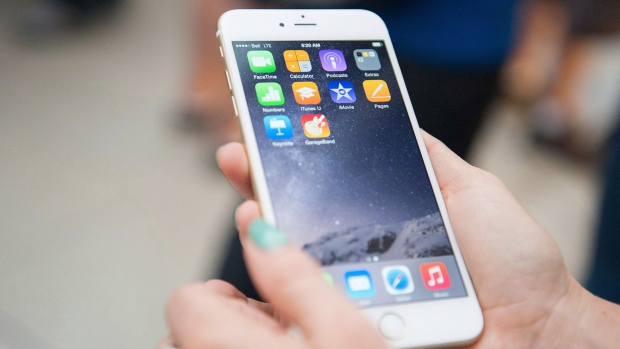
Do you order your most-used apps at the bottom of your smartphone’s screen? Are they lined up along the side for your dominant thumb’s convenience? Maybe they’re neatly packed away in folders? Or perhaps, there’s no method to your madness and your icons are placed entirely at random on your device?
- Scroll down or click here to vote in our poll of the day
Whether you’ve tried them all or haven’t given it a second thought, arranging the icons for your phone’s apps can be visually pleasing, not to mention efficient.
To discover some of the most useful ways to display your apps, CTVNews.ca spoke with a number of tech experts to learn how they order their app pages and what they recommend.
1. Folders by theme:
Tech guru, TV personality and busy mom Amber MacArthur swears by the folder method when she’s positioning her app icons on her Samsung Galaxy S7. The Toronto-based tech expert categorizes her apps into folders by theme such as travel, social media or kids.
MacArthur said she doesn’t use the gaming apps her eight-year-old son favours on her phone, so she puts them all in a folder to keep them in one place.
“I think I’m probably like most people, especially parents, where I end up having a lot of apps that aren’t apps that I use,” she explained. “I think folders have just become an easier way to manage some of those different apps.”
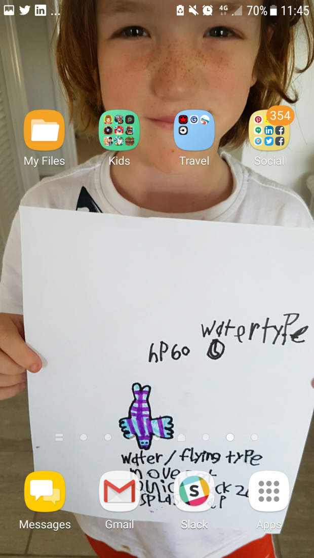
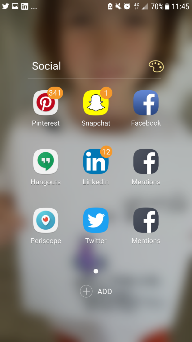
For those naysayers that argue that folders make it difficult to find certain apps, MacArthur has a simple solution. She uses the search function on her Android phone, in her case Google Gesture Search, to quickly find what she’s looking for.
MacArthur strongly recommends making use of the search bar on your device (for Apple phones just swipe down) to quickly type in the name of the app you need.
Amber’s pro tip: Don’t forget to regularly delete the apps you don’t use. If you haven’t used it in six months, delete it.
2. Reachability:
With her large iPhone 7 Plus, Toronto-based web designer and tech expert Avery Swartzarranges her apps based on how easily she can reach them with her thumbs. She says she prefers to have all of her apps on one screen so her home screen is a combination of folders and standalone icons.
Because it’s more difficult for her left thumb (she’s left-handed) to reach the top of her phone, Swartz places her most used apps at the bottom of her screen and the folders with the less-used ones at the top.
“I put the lesser-used apps or the lesser-used folders in those literally harder-to-reach places,” she said.

Like MacArthur, the folders located at the top of her screen are organized by themes, such as music or photography.
Avery’s pro tip: Experiment by moving icons around and trying different methods to see what works for you.
3. Migrate apps:
Tech journalist Andy Walker says he’s always paying attention to how frequently he’s using his apps. If he finds that he’s regularly tapping a certain app, he says he’ll migrate it to the home screen of his iPhone 6.
“I tend to promote the apps that I use the most from the back end and I move them forward as I use them,” he said.
Although he doesn’t have a specific schedule for moving his apps around on his six pages, the Tampa, Fla. author says he tends to rearrange icons several times a week. He finds that he really only needs the 20 or so apps on his home screen on a daily basis.
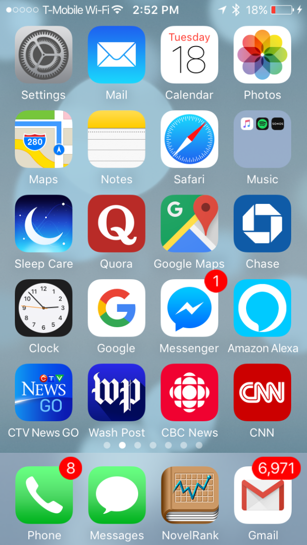
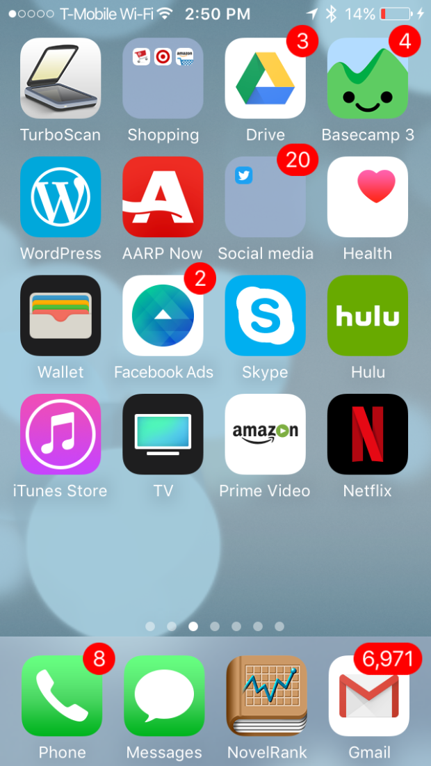
“My everyday apps are on the home screen. Some of the lesser stuff, like banking for example, is on the second screen and then it goes from there,” Walker said.
Andy’s pro tip: Pay attention to what apps you’re using the most often and give them priority by moving them forward.
4. Edit the app drawer:
Both Android and Apple devices include an app drawer (sometimes called a dock) at the bottom of the home screen with four or five app icons already in place.
Toronto-based Tech expert Marc Saltzman says not enough smartphone users edit the apps that are in this convenient location. He says he swaps out the prearranged apps at the bottom of his Samsung Galaxy S8 Plus’ home screen and replaces them with ones he uses more often.
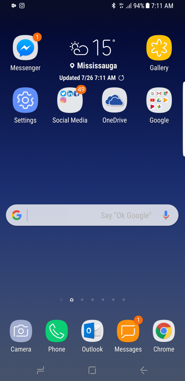
“You don’t have to use the ones that they give you if you don’t use them,” Saltzman said. “For example, Apple will give you Safari as their web browser but a lot of people prefer Chrome so why keep Safari down there when you don’t use it?”
Saltzman said smartphone users can usually add an extra icon or two to the app drawer for extra convenience.
Source:-.ctvnews


