 We already have a fairly good idea of what the iPhone 14 will look like when it finally ships next year. And other than the death of the notch for the Pro model, we’re not expecting anything dramatically different from the next Apple phone.
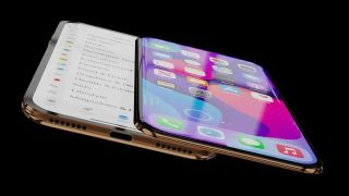
But that doesn’t stop people dreaming, and on the wackier end of the spectrum is this sliding design from ConceptsiPhone, which you can file under “cool, but enormously impractical.”
- The best iPhones in 2021
- iPhone 13 vs iPhone 12: What’s the difference?
- PLUS: iPhone SE Plus just tipped for 2022 — but it’s not what you think
As you can see, this concept imagines a world where the iPhone gets an expanded screen by physically sliding a top panel out to reveal a second one underneath. Only this one only goes part of the way out, like 2010’s Nokia C6-00, rather than expanding to be a full-size second screen like the newly released Microsoft Surface Duo 2.
In the video, the iPhone 14 is shown revealing news headlines, displaying the settings menu and offering a much larger landscape keyboard. It’s all very flashy, but ultimately a bit pointless — an extra panel just for the sake of it.
The worst of all worlds
I’m reminded of that Jurassic Park line: “Your scientists were so preoccupied with whether or not they could, they didn’t stop to think if they should.” Because if this were Apple’s answer to the Samsung Galaxy Z Fold 3, people would rightly ask if the company’s designers had taken leave of their senses.
After all, the Galaxy Z Fold 3 is desirable because it combines a phone and small tablet in one. This iPhone concept provides, at best, 1.5 phones — and the 0.5 part looks like a pain to use, too.
Of the purposes demonstrated, only the larger keyboard is of any practical use other than showing off. And even then, you’d be better served with a physical BlackBerry style keyboard, rather than another touchscreen.
But there’s a reason we don’t see many of those nowadays. Samsung used to offer a physical keyboard case for its Galaxy S phones, but stopped selling them with the Galaxy S8, presumably because they weren’t popular enough.
Given the main USP is straight out of Cloud Cuckoo Land, it’s perhaps unsurprising that the video chooses to double down with “Air Charge Technology”, where a plug transmits power over the air. That’s theoretically possible, but enormously wasteful — which is ironic, given the Apple News Plus headline on the front of the phone render talks about 85% of the world being impacted by climate change.

Still: it’s nice to see Touch ID back, and no notch in sight.
While this design looks thoroughly unlikely, it’s widely regarded as a matter of time before Apple treats us to an iPhone Flip. But as for timelines, we’re looking at 2023 at the earliest, according to Ming-Chi Kuo. When it does finally arrive, though, you can bet Apple will have come up with something a lot more practical than this particular concept.
[“source=tomsguide”]


